Digital Realty Mobile web

Vehicle Marketplace: Enhancing UX/UI for LATAM Leader Encuentra24.com

Vehicle Marketplace: Enhancing UX/UI for LATAM Leader Encuentra24.com

The transformation of UX and UI design at Encuentra24.com stemmed from a deep understanding of changing customer demands, coupled with a commitment to deliver a more immersive and efficient experience.

Acknowledging the pivotal role of innovation in the automotive and online marketplaces, Encuentra24.com committed to refining its offering to remain a leader in design and usability. This evolution not only seeks to dazzle users with a visually captivating design, but also to streamline interaction with our platform, ensuring that technology is effortlessly integrated into their daily routines and preferences, thus offering an unparalleled experience at every step of their journey.

Responsibilities

Responsibilities

UX, UI

UX, UI

UX, UI

Lenght of the project

5 Meses

5 Meses

5 Meses

Industry

Industry

E-commerce-Marketplace

E-commerce-Marketplace

E-commerce-Marketplace

Tools

Tools

Figma | Trello | Notion | Whismical

Figma | Trello | Notion | Whismical

Figma | Trello | Notion | Whismical

Company size

Company size

250+

250+

250+

Deliverables

Deliverables

UX Research, Feature Map, User Flows, Functional Requirements, Heatmaps, User interviews Results, Wireframes.

UX Research, Feature Map, User Flows, Functional Requirements, Heatmaps, User interviews Results, Wireframes.

UX Research, Feature Map, User Flows, Functional Requirements, Heatmaps, User interviews Results, Wireframes.

UI Design

UI Design

Design Library, Mood Board, Style Concepts, Style Guide, Static Mockups, Clickable Prototype (Pixel Perfect)

Design Library, Mood Board, Style Concepts, Style Guide, Static Mockups, Clickable Prototype (Pixel Perfect)

Design Library, Mood Board, Style Concepts, Style Guide, Static Mockups, Clickable Prototype (Pixel Perfect)

Challenges

Challenges

Challenges

Improving user retention and turning visits into potential customers.

Improving user retention and turning visits into potential customers.

Improving user retention and turning visits into potential customers.

Results

Results

Results

The redesign of the Encuentra24.com vehicle marketplace has been a resounding success, exceeding expectations and delivering exceptional results in terms of user engagement, retention, conversion, business growth, and brand reputation.

Key Results:

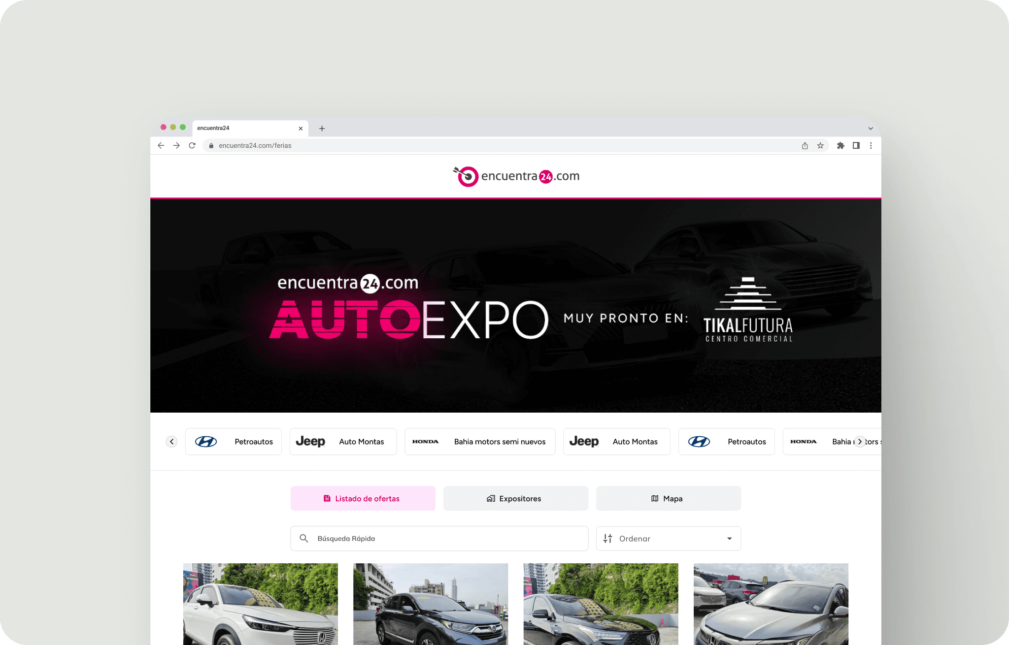
  • Significant increase in user engagement: The addition of a dedicated section for vehicle fairs has boosted user engagement, attracting a wider and more diverse audience.

  • Improved visitor retention and conversion rates: The simplicity and adaptability of the design have been widely praised by the user community, resulting in longer site durations and higher conversion rates.

  • Consolidation of leadership in Central America: The EN24 marketplace has further solidified its leading position in Central America, attracting an even greater number of vehicle buyers and sellers.

  • Business growth and brand strengthening: The success of the redesign has fueled business growth and strengthened the EN24 brand as a trusted player in the regional automotive market.

  • Exceptional scalability and performance: The design's scalability and performance have proven robust, allowing EN24 to successfully handle increased traffic, even exceeding +455,000 daily visits, without significant technical issues.

5% +

Conversion Rate

Conversion Rate

Conversion Rate

15% +

Increased user retention

Increased user retention

Increased user retention

17% +

Increased time spent on the website

Increased time spent on the website

Increased time spent on the website

Work process

Work process

Work process

UX/UI Research and Analysis: During this phase, we employ a combination of user interviews, surveys, in-app metrics analysis, competitor research, and industry trend evaluation to understand user needs and pain points.

Information Architecture: We utilize research findings to optimize the application's content structure and prioritize features based on user needs. The goal is to enhance logic and user-friendliness.

Wireframing and Prototyping: We begin with low-fidelity wireframes to visualize layout and navigation. These are iteratively refined based on user feedback. High-fidelity interactive prototypes are then created for realistic design testing.

Usability Testing: We conduct usability testing with diverse users to validate the design and pinpoint areas for improvement. Design adjustments are made accordingly to ensure a seamless user experience.

Visual Design and Style Guide: A cohesive visual language is established, encompassing color palettes, typography, and iconography. A style guide is created to preserve design consistency across future updates, promoting a unified and engaging experience.

Stack for this project

Stack for this project

Stack for this project

Conclusion

Conclusion

Conclusion

Encuentra24.com's overhaul of their auto marketplace is a shining illustration of innovation and triumph in the e-commerce industry. There's a substantial enhancement in user interaction, increased involvement, and the firm's market leadership has been solidified. This initiative acts as a blueprint for other enterprises looking to refine their digital ecosystems and realise prosperity on the internet.
Mobile Figma prototype pixel perfect

Web Figma prototype pixel perfect

Osvaldo

A Dominican UX/UI designer with a master's degree in E-commerce, exploring early-stage startups ventures.

© 2024 Osvaldo. All rights reserved.

Osvaldo

A Dominican UX/UI designer with a master's degree in E-commerce, exploring early-stage startups ventures.

© 2024 Osvaldo. All rights reserved.