E-commerce
Bang and Olufen

E-commerce
Bang and Olufen

E-commerce
Bang and Olufen

The change in user experience (UX) and user interface design (UI) at B&O was due to a deep understanding of our customers' changing needs and a desire to provide them with a more engaging and functional experience.

Recognizing the importance of innovation in the world of technology and consumer electronics, B&O committed to evolving its products and services to stay at the forefront of design and usability trends. This transformation not only aims to surprise our users with visually stunning design but also to simplify interaction with our products, ensuring that technology seamlessly adapts to their lives and needs, providing an exceptional experience at every stage of the user journey.

Responsibilities

Responsibilities

UX, UI

UX, UI

UX, UI

Lenght of the project

4 Moths

Industry

Industry

E-commerce

E-commerce

E-commerce

Tools

Tools

Figma | Trello | Notion | Whismical

Figma | Trello | Notion | Whismical

Figma | Trello | Notion | Whismical

Company size

Company size

500+

500+

500+

Deliverables

Deliverables

UX Review, Feature Map, Functional Requirements, User Flows, Wireframes

UX Review, Feature Map, Functional Requirements, User Flows, Wireframes

UX Review, Feature Map, Functional Requirements, User Flows, Wireframes

UI Design

UI Design

Design Library, Mood Board, Style Concepts, Style Guide, Static Mockups, Clickable Prototype

Design Library, Mood Board, Style Concepts, Style Guide, Static Mockups, Clickable Prototype

Design Library, Mood Board, Style Concepts, Style Guide, Static Mockups, Clickable Prototype

Challenges

Challenges

Challenges

Improving user retention and turning visits into potential customers.

Improving user retention and turning visits into potential customers.

Improving user retention and turning visits into potential customers.

Results

Results

Results

The redesign of this e-commerce site for B&O has paid off, and the results are remarkable. In the initial phase of implementing the changes, I managed to raise the Net Promoter Score (NPS) from 6 to an impressive 8.

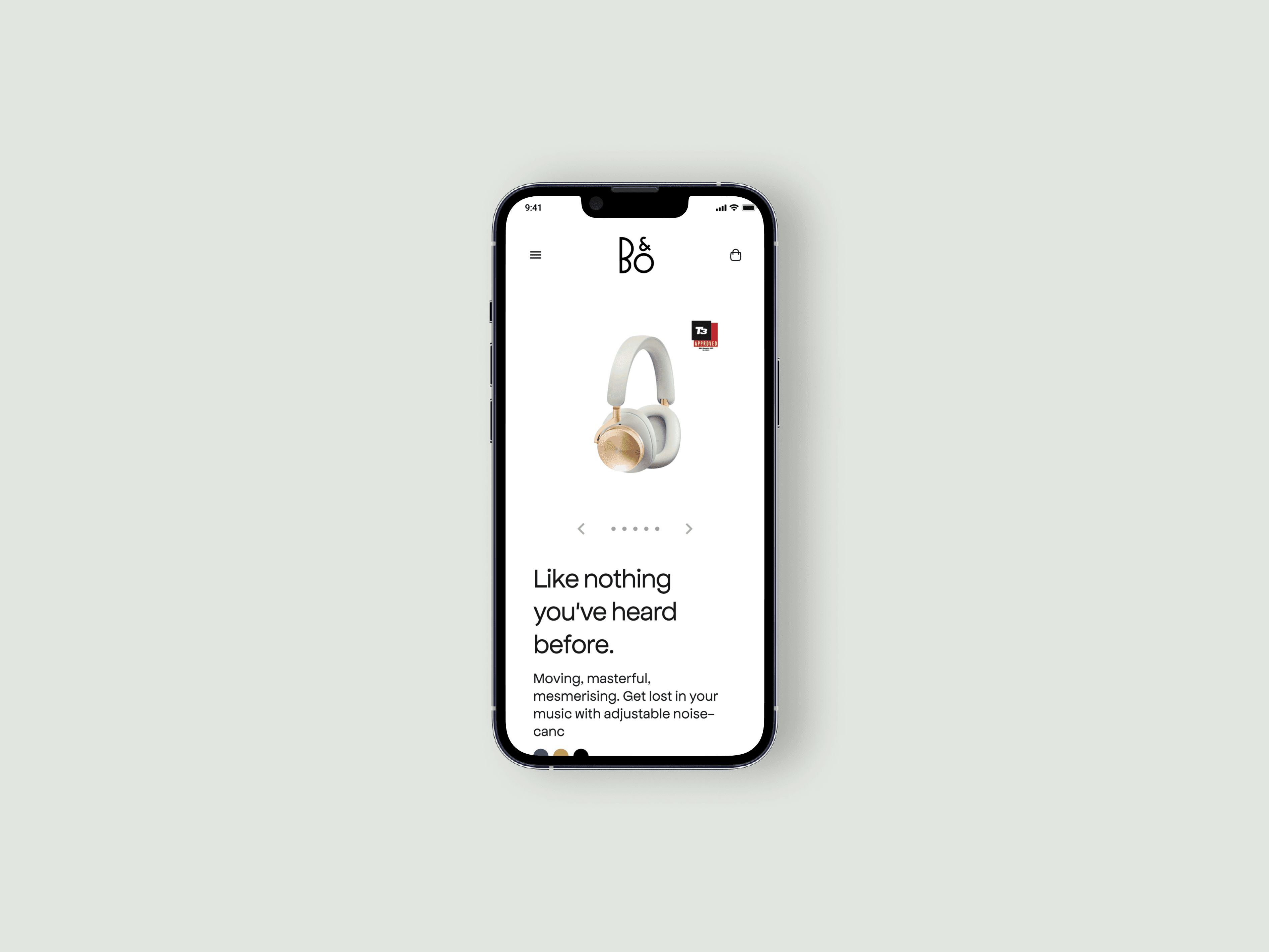
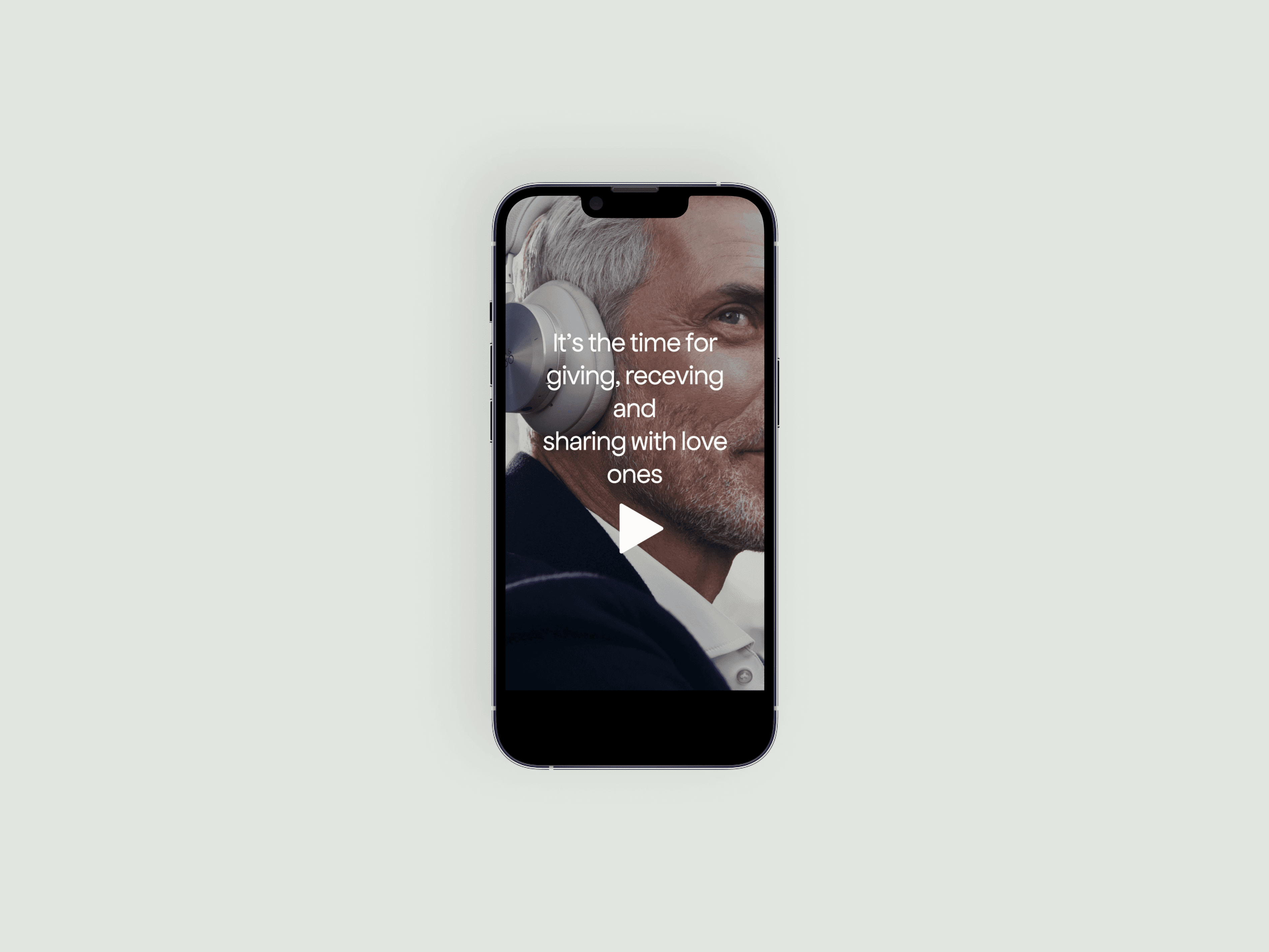
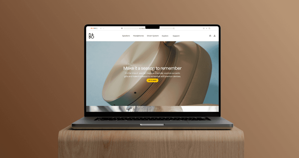
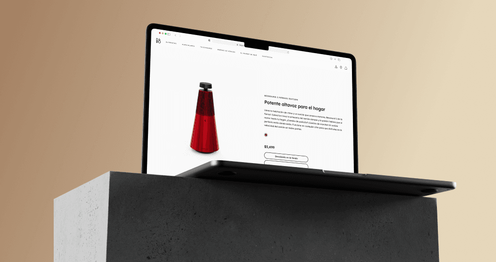
This redesign has brought about a more intuitive and appealing interface for users. Navigation has become simpler and more efficient, allowing customers to access products more quickly and comfortably. Additionally, we have introduced customization options and product recommendations, significantly increasing user engagement.

The most impactful result has been the increase in customer satisfaction, as demonstrated by the improved NPS. We are delighted to see how these changes have not only enhanced the shopping experience but also strengthened the relationship with our customers. These results motivate us to continue working towards delivering an exceptional online shopping experience at B&O.

27%

Improved user registration process

Improved user registration process

Improved user registration process

17%

Increased user retention

Increased user retention

Increased user retention

32%

Increased time spent on the website

Increased time spent on the website

Increased time spent on the website

Work process

Work process

Work process

UX/UI Research and Analysis: In this crucial phase of our user experience (UX) and user interface (UI) design work process, we conduct user interviews, surveys and analyse in-app metrics to understand pain points and user needs. In addition, we study competitor applications and industry trends to gather valuable insights.


Information Architecture: Based on our research findings, we restructured the content of the application, prioritising features and information according to user needs. This allowed us to create a more logical and user-friendly structure.


Wireframing and Prototyping: We designed low-fidelity wireframes to visualise the new design and navigation, iteratively refining them based on user feedback. We then create a high-fidelity interactive prototype to test the design in a near-real environment.


Usability Testing: We conducted usability testing with a diverse group of users to validate the design and identify areas for improvement. Taking into account the feedback received, we made the necessary adjustments to the design to ensure a smooth and satisfying experience. Interviews and surveys were conducted.


Visual Design and Style Guide: We developed a cohesive visual language including colour palettes, typography and iconography, ensuring consistency throughout the application. In addition, we created a style guide to maintain design consistency in future updates, ensuring a uniform and engaging user experience over time.

Stack for this project

Stack for this project

Stack for this project

Conclusion

Conclusion

Conclusion

The successful restructuring of B&O's e-commerce website effectively addressed previously existing usability issues, resulting in a noticeably more intuitive and user-friendly experience. This redesign of the user interface and user experience (UI/UX) led to a series of tangible improvements in how customers interact with the online platform.

The focus on optimizing the user experience and website navigation allowed for a significant increase in B&O's user adoption. Furthermore, customer engagement has experienced an impressive boost, as they now find it much easier and appealing to explore products, make purchases, and manage their accounts on the B&O website.

This project highlights the critical importance of having a solid and well-conceived web design for UX designers in the e-commerce realm. In B&O's case, this focus on improving the user experience has proven to be a strategic investment that has resulted in tangible outcomes and ongoing customer satisfaction. B&O's e-commerce website now stands out as an example of how a well-executed redesign can transform the relationship between a company and its customers, elevating the online shopping experience to a whole new level of accessibility and usability.

Demo mobile clickable (limited)

Demo mobile clickable (limited)

Demo mobile clickable (limited)

Demo Web clickable (limited)

Demo Web clickable (limited)

Demo Web clickable (limited)

Osvaldo

A Dominican UX/UI designer with a master's degree in E-commerce, exploring early-stage startups ventures.

© 2024 Osvaldo. All rights reserved.

Osvaldo

A Dominican UX/UI designer with a master's degree in E-commerce, exploring early-stage startups ventures.

© 2024 Osvaldo. All rights reserved.